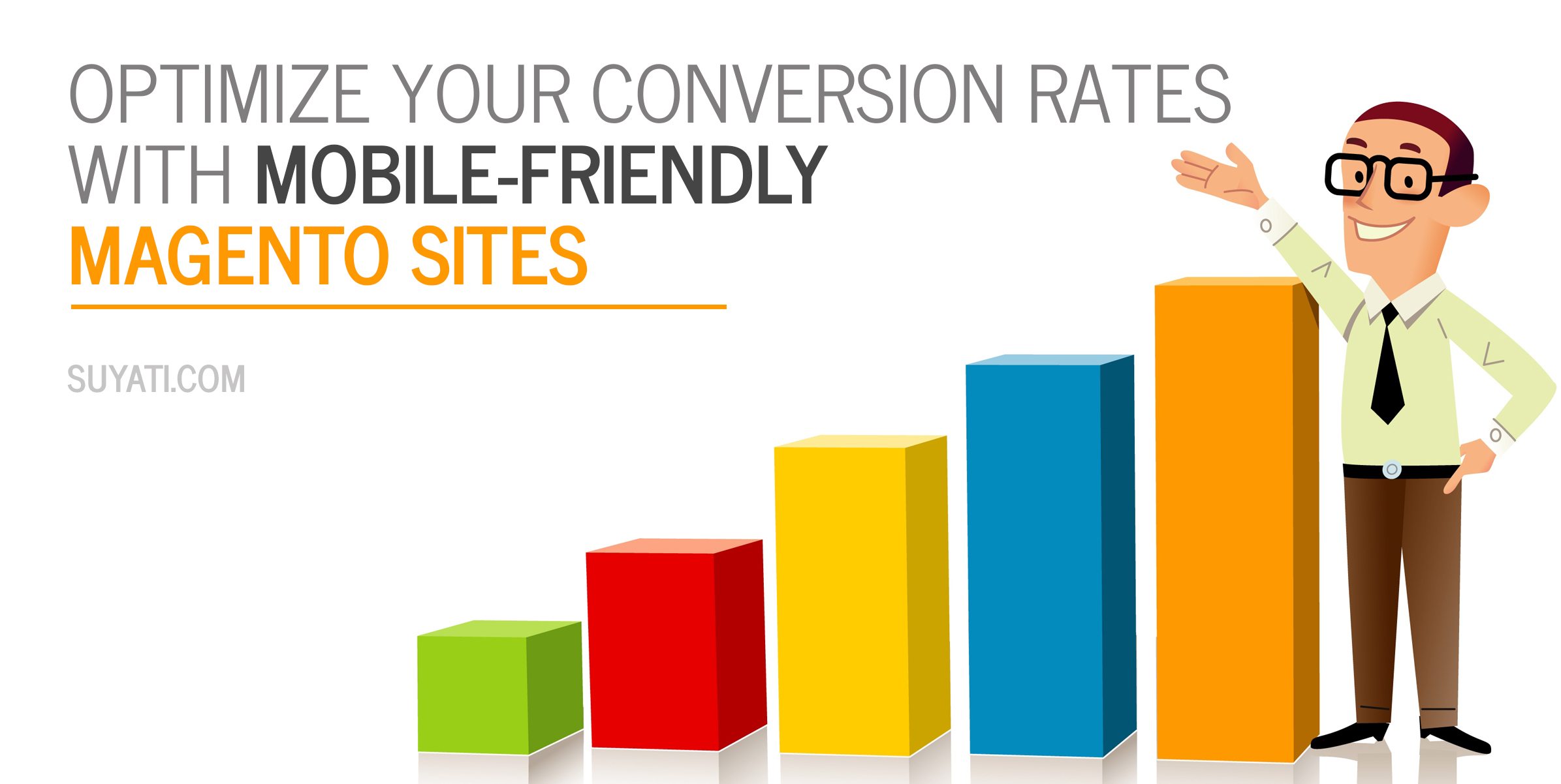
Being ‘mobile responsive’ is no longer an optional after-thought today, but it is a basic requirement for an enterprise to survive.
More people now access internet using mobile devices. Recent surveys indicate that search results coming through desktop account for 61%, tablet 64%, and mobile devices 78%.
In tune with the changing times, a major Google algorithm change on April 2015, which gave priority to mobile-friendly sites, while pushing down less mobile friendly sites, effected a paradigm shift, and set the trend for the times ahead. Webmasters who do not give priority to optimizing for the mobile now run the risk of losing a substantial portion of their traffic.
The rise in popularity of the mobile notwithstanding, today’s tech savvy users use different devices to access the same ecommerce store. They may, for instance, discover a product on their tablet, use the smartphone to dig for more information when proceeding to the office, and finally conclude the transaction from the office desktop. Even among mobile devices, the choice is split between iOS powered iPhones, Android devices, Windows powered smartphones, and Blackberry. Then there are various mobile devices, each with different screen size. Seamless connectivity and transition are important across all these diverse channels if the customer is to convert.
The best way of optimizing the Magento site for such diverse hosts is by deploying responsive themes, which streamlines the experience over different mobile screens, even while consuming lesser resources. Responsive themes usually use similar HTML files along with different CSS files.
Here is a rundown on the most popular extensions, which contribute towards delivering a fabulous UX, and boosting conversions in the process:
Magento Mobile Theme
The official Magento Mobile Theme offers several mobile themes, including mobile friendly shopping cart and payment interfaces, and delivers highly advanced functionality such as ability to embed audio and video files. It becomes very easy to apply color or change the layout of the Magento website, in just a few minutes. There is an intuitive search function as well. The theme delivers a very user friendly and seamless UX, prompting users to stay and conclude the purchase.
The themes on offer fit the store with all modern mobile devices. The extension detects mobile devices automatically, and switches to the mobile layout automatically.
Neddev Magento Mobile Theme
The Neddev Magento Mobile Theme almost matches the official Magento Mobile theme in functionality, offers advanced customization options, and is easy to install as well.
Responsive Admin Template
The Magento Responsive Admin template gels in perfectly with all leading mobile devices, and offers some intuitive features such as choice of five color skin, floating effects, and more. It is easy to customize the responsive layout with Bootstrap, and the process is quick.
The combination of easy interface and power packed features make this template stand out. The friendly UI with simple horizontal and vertical menus that make navigation easy and smooth, is enhanced by impressive and eye catching icons. The layout is intuitive as well, with easy to find search tool, preview button and help button designed at the header of Admin panel.
Argento
The Argento template for Magento is created factoring in the best ecommerce store practices, and co-opts 15+ popular Magento extensions. The extension, based on CSS3, is optimized both for speed and SEO, and tested to work well on all popular mobile devices and browsers.
Argento delivers a seamless UX on both mobile and desktops. It scales to fit any browser width and screen resolutions. Argento is based on CSS3 sprite technique that reduces the number of HTTPS requests, and hence improves speed. It incorporates 40+ modifications to the default Magento structure, and offers improved HTML structure, all aimed at fixing SEO. Developers using Argento can spare themselves the task of creating a separate mobile template.

ShopGate
The ShopGate tool offers several themes compatible with smartphones and tablets, and additionally has the capability to generate native apps for iPad, Android and iPhone powered devices. It goes beyond offering basic templates, and offers readymade solutions for many marketing related features, such as mobile coupons, push notifications, barcode, QR scanners, daily deals, store locators, and more.
Mobify
Mobify makes it easy to incorporate exclusive mobile shopping platform to any existing Magento website or web store. After installation, Mobify integrates to the e-store, and infuses mobile optimized capabilities for the desired functionality, cutting across OS and device. Mobify delivers seamless shopping experience across different capabilities such as payments, touch security, and more. The advantage of Magento is that it works seamless with existing marketing software, without having to make modifications or tweaks. It also offers handy customer experience metrics. There is a free basic version available, and also various paid plans.

CouchCommerce
CouchCommerce optimizes a Magento desktop website for the mobile. On installation, the extension builds the related web inventory for an online store in a few minutes, automatically. The mobile optimized site retains the URL structure of the desktop version, boosting SEO.
Tenfoot
The Tenfoot extension works similar to CouchCommerce, in that it automatically converts a desktop site to a mobile friendly version, without any technical know-how from the user’s part.
One Step Checkout
The Magento One Step Checkout Extension makes it possible to create intuitive checkout pages that work seamlessly with any mobile screen. It offers a pleasing experience for the end user, resulting in fewer frustration driven cancellations. It delivers superior customer experience by concluding the entire order in a single page, instead of the user having to bear the agony of loading six pages, one at a time, to complete the transaction.
Zopim Live Chat
Installing the free Zopim Live Chat extension offers a seamless live chat capability to the mobile ecommerce site. Live chat is now becoming indispensable to drive sales, and today’s customers demand instant results, and would go elsewhere rather than wait. This can be set up easily and takes just a few minutes. As an added bonus, the extension monitors site visitors as they surf all over the site, providing valuable location and browsing history information to the site owners. Site owners can use such information to deliver custom offers, further increasing the chances of conversion.
While automated switch over using responsive themes works best in most situations, it may not be the best option when the mobile and desktop themes have substantially different layouts. In such situations, the back end trying to skin the mobile front-end on top of a full-site layout structure can result in grave complications.
One alternative in such situation is to add php mobile-detection code into the head.phtml template of the main site templates, and effect JavaScript redirect to the mobile front-end, on detection of mobile device. Added session variable manipulation would allow switching freely between a full-site theme and mobile-theme easily.
Regardless of the options chosen, it pays to back up data, and also has the services of a professional Magento developer or consultant ready, to overcome any glitches. Also, make sure to install an accepted and tested theme as a poor selection can ruin your business.
With several themes going around, what would be your criteria for selecting the ideal one for your business? Leave your comment below.
To know more about Suyati’s expertise in Magento, please send an email to services@suyati.com.