The digital landscape is getting more and more fragmented by the day, and with this, the number of devices, platforms and browsers that a website needs to work with is growing. This has forced a radical change in web designing. With mobile devices of varying screen sizes tipped to overtake desktop computers in the immediate future, the hitherto practice of building a static fixed web page that would display optimally on the most common screen resolution, and another mobile version of the site suiting a single common mobile screen, is now wholly inadequate.
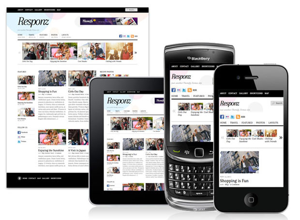
Image Source: blog.templatemonster.com
Responsive web design (RWD) is the new approach that promises to offer a solution to the problem of suiting a website to multiple media, without having to recreate for every screen resolution. It entails using flexible, fluid and adoptive layouts that automatically responds to the environment and gels in with just about any screen size.
RWD design offers multiple fixed width layouts or multiple fluid grid layouts. There is also a mixed approach, with fixed width for large and medium screens, and fluid width for small screens. Such sites use CSS media queries to serve different style properties depending on the screen size, resolution, orientation, color capability and other device characteristics.
However, the concept of a responsive website goes much more than simply the web layout adapting well to the screen size. Adaption to the screen size is the basic requirement of a responsive website, but a truly responsive website goes much beyond.
RWD is a new approach to web designing that shifts away from thinking in pages to thinking in systems. Such sites use media queries to scope styles to specific capabilities, applying styles based on the capabilities that match the query. Developers combine queries that test for features such as width, height, max-height, device-height, resolution, aspect-ratio, orientation, and resolution, using semantic operators such as “AND” and “NOT.”
Responsive websites have a flexible grid-based layout that uses relative sizing, and have flexible images and media. The positioning, layout of margins and spacing for different media as per the results of the query search is done through CSS. RWD also requires flexible images and media, which would load differently depending on the media. Web developers ensure this by scaling or by invoking the CSS overflow property.
A RWD best practice is a design approach that starts mobile up rather than creating for the desktop first and trying to optimize for the mobile later. In the latter approach, even if the formatting holds in the small screen, many objects may become unreadable and calls to actions such as pressing or swiping a button becomes impossible.
The RWD approach entails developing modular elements, with modules loading depending on the screen resolution and other elements of customization. A responsive site takes into cognizance what the visitor would require first when visiting the site from a specific device and lays down the content accordingly. A visitor may find content loading differently in the same site, when they access it from the desktop and the mobile. For instance, when the site is accessed from mobiles, larger tab that facilitate easy swiping loads, but in a desktop screen, a radio button may replace this large tab. In the small mobile screen, some elements may even skip loading.
With responsive web design, one website and the same content works for all channels, eliminating the need for redirects. This makes the developer’s work that much easier, speed up the process, while helping SEO and content management in the process!