So you have a website powered with Ektron CMS, and now you started thinking about providing a great web experience for your web site visitors across multiple channels. Yes! This is the high time; if you still lack mobile capabilities for your website you will be lost in the crowd. Having a website that can provide great experience over any device will considerably improve your traffic and conversion.
So how do we do it with Ektron?
With this series of blog posts let us dig into the mobile capabilities of ektron.
Creating a mobile website with Ektron:
When it comes to creation of a mobile website, you are left with two choices,
One is having a separate mobile web site (M DOT website) and the other one is creating a responsive website, which can act as a mobile and desktop website simultaneously by means of Responsive Web design.
I am sure you have gone through the debate of “which is better” amongst this approaches. Take a look at the advantages of RWD here.
What does ektron suggests here?
Ektron integrates the core aspects of responsive web design with the WCM in order to facilitate the development of a responsive web site effortlessly.
Let us take a look into the important mobile capabilities of Ektron. The fundamental mobile capabilities of ektron includes:-
- Mobile Templates using Ektron
- Adaptive Image Resizing with Ektron
- Geo Mapping & Mobile Preview
Development of Mobile Template is one of the core mobile strategies of ektron. It reduces the pain points of re-designing your entire website in order make it fit for mobile devices.
So you have your typical ektron website with few PageBuilder templates in it.And you have number of PageBuilder pages which makes use of these wireframe templates. Now you need to optimize all these PageBuilder pages for mobile.
How do we do that?
This can be done by developing separate version of templates, i.e. Mobile Templates for your respective PageBuilder templates, by forecasting the activity of your website visitors in a mobile device.
It’s obvious that the visitor is expecting a different site experience across different devices.
So the mobile template should be developed from a mobile user’s perspective, a template that makes use of lesser contents compared to that of normal PageBuilder template, with a different styling that fits for the mobile device.
(New to PageBuilder? Don’t worry! Go through this blog post to get an idea about it.)
Now you have got different mobile templates for Smart phones, Generic phones and Tablets.
These mobile optimized templates needs to be associated with the normal page builder templates in order to serve the “mobile pages” when the user browse the web page from a mobile device.
Once a mobile template is created it can be associated with number of mobile devices by creating device configuration groups in Ektron. These device configuration groups group the mobile devices in the following ways:
- Group by Model or OS
- Group by Breakpoint
This can be done by navigating to:
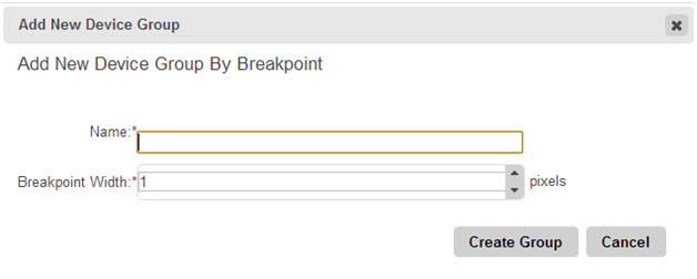
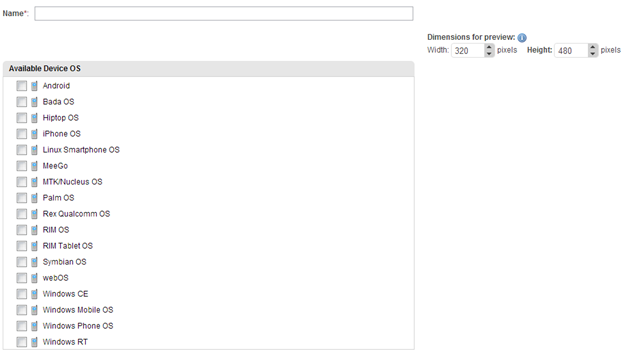
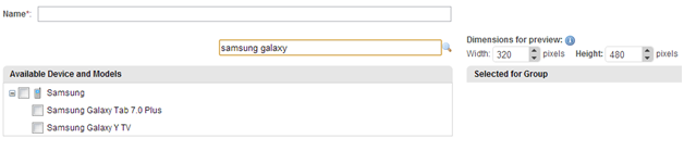
Settings > Configuration > Mobile Settings > View All Device Groups > New Group

Group by Breakpoint:
This grouping organizes devices based on their sizes.
Group by OS:
This grouping organizes devices based on their Operating Systems.
Group by Model:
This grouping organizes devices based on their Model.
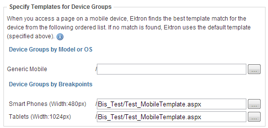
By making use of these device groups the different mobile templates can be assigned for the intended device configuration.
The following screenshot shows association of mobile templates for a certain PageBuilder template.
Depending on the wireframe design, parent PageBuilder template and the mobile templates may have common Dropzones in them. Ideally mobile templates will be having lesser Dropzones than the parent PageBuilder templates for a better mobile experience.
Remember, the DropZone IDs in all the templates should be of the same. Also ensure that the ek_EnableDeviceDetection is set to true in root/web.config.
Now we have a PageBuilder template, which has got a mobile template associated with it.
Now when a user browse any of the PageBuilder page created with this template from a mobile device the user will be getting a mobile optimized web page, and for a desktop user the ordinary web page will be displayed.
Now let us test a sample PageBuilder page,
Desktop view:

Mobile View:

Here we go! We are getting two faces of the same web page for two devices! Thus we have optimized our PageBuilder Template for mobile.
Want to know the other mobile capabilities of Ektron? Wait for Part-II.