Let me start of this blog post with the assumption that you have gone through the first part of this blog series. If not, go through the earlier blog post here, I am waiting!!
In the earlier blog post we have gone through creation of mobile templates in Ektron. By developing different mobile versions of PageBuilder templates we were able to provide different versions of a single page to the different devices by leveraging the popular Responsive web design.
The idea of mobile template is to minimize the contents and develop an optimized template that avoids pinching, zooming and horizontal scrolling in order to provide a better web experience to the mobile user.
How about the contents in the web page? How about the images in the web page? Are you going to provide the same image for all the devices?
Oops! That is not an ideal choice!
Images: The Storytellers
Since images are considered as the most significant ingredient of a web page, it is important to optimize them for the device through which it is been browsed.
Ideally images should adapt with the device through which it is seen. It should be of appropriate size and resolution in accordance with the site visitors screen size.
Well, Does that means we are in in need of a developer to create the different versions of an image to serve multiple versions of it to different screen sizes?
That’s not the way ektron do things! Ektron gives the freedom to marketers to optimize the images for different screen sizes with few settings.
And how is that?
Adaptive image re-sizing in Ektron:
Breakpoints for Adaptive Images:
So you have an image with you, which need to be embedded in some of your PageBuilder page. You need to have multiple versions of this image depending on the screen sizes that you target for your website.
These screen sizes are considered as the “Breakpoints” in Ektron. Ektron’s Breakpoint manager allows you to define these breakpoints.
By enabling the breakpoints in the settings, once an image is uploaded to the workarea, Ektron creates multiple copies of the image based on the breakpoints.
And when the webpage with this certain image is viewed from devices that match the breakpoint, the copy of the image that matches the screen size is being rendered.
Thus , it improves the loading time as the image size is lesser compared to the original version of the image and also provides a better web experience to the site visitor as the image quality is not reduced.
Breakpoint Settings:
Now let us see how to set breakpoints in the workarea:
Go to Settings>Configuration>Mobile Settings>Adaptive Image Settings
The Breakpoint Settings allows adding Breakpoints to scale the images for defined dimensions.


Also the location for generation of adaptive images can be specified here:

Other settings for adaptive images include:
Settings>Configuration>Mobile Settings>Adaptive Image Settings>Advanced Settings
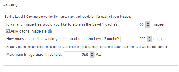
The file size criteria for an image to be re-sized can be specified in the advanced settings. By default its 80KB, smaller images are not re-sized.

Caching settings also can be configured here.Which includes the Level 1 and Level 2 caching. Where level 1 refers to caching the image file information and level 2 refers to caching the image as byte array.
Ektron picks up the most suitable image for a screen size based on the device description repository, Wireless Universal Resource File (WURFL).So there is no need to write any custom code to handle this.
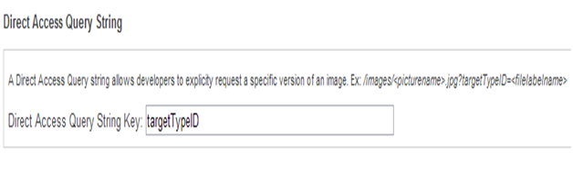
If the developer want to request a specific image, other than relying on the device detection capability this can be done by passing the image file label as query string. This query string key can be set here.
Test Adaptive Images in Editor:
Let us add an image to the Library in the workarea, and bring that to content. After adding the content to the editor click on the “Inspector”, select the “Advanced” tab in the pop up to see the Responsive images for the selected image.
The following screen shot shows the images for the defined breakpoints:
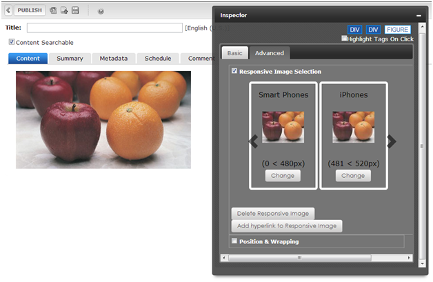
If you have a better image for a smaller screen size than the re-sized image, you can assign that as Responsive image by clicking the “Change” option.
Now Ektron have already made different versions of the image with different sizes defined in the Breakpoint Manager and depending on the device through which the visitor is accessing the resource, the most suitable version of the image will be served.
So once the settings are configured for Breakpoints, all that needs to be done by a marketer is “Drag and Drop” an image to the Editor in Ektron or add an image to library. The rest will be done by Ektron.
Significant Advantages of AIR in Ektron:
- No custom coding for resizing the images.
- Marketers can choose appropriate “Responsive images” through content editor.
- Workarea Administrator can set the breakpoints to enable re-sizing.
- Works while upgradation from lower versions of Ektron.
- Provides great performance on smaller screen sizes.
Looking forward to know more mobile capabilities of Ektron? Catch up with our upcoming blog!