If you are not familiar with Responsive Web Design (RWD), then you might just have overlooked the optimal solution for a gratifying web experience for your users. At this juncture, to say that RWD is the buzzword of online marketing would not be an overstatement. The reasons shall soon unfold once you get to know more about RWD and what it can do to give your business an edge over your competitors.
In a nutshell
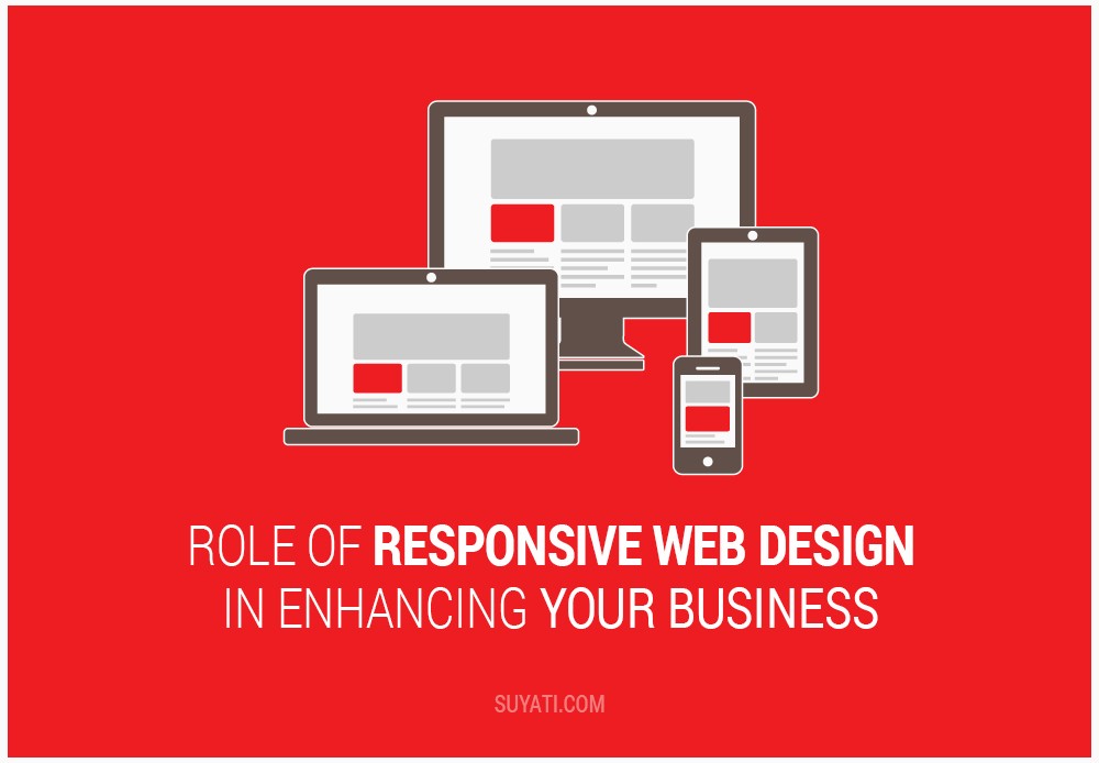
The term Responsive Web Design was coined by Ethan Marcotte, an independent web designer, who also wrote an article and a book in the same name. RWD refers to the approach to create flexible and intuitive web designs that respond and adapt to the user’s preferences and environment based on screen size, resolution, platform, and orientation. It depends on deploying CSS and HTML to create fluid grid, flexibleimages, and media queries.
Synchronize with the dynamic
The Responsive Web Design is a contemporary concept in web designing and the corporate world to synchronize with the dynamic world of cutting edge technology. With the advent and proliferation of online websites in the industry, the current best practice is to build a responsive website. The benefits of this practice are manifold. A Responsive website effortlessly tailors itself to whichever device it is being viewed from by resizing, hiding, shrinking, enlarging or moving the content to cater the needs of the user and his/her device.
A peek into the future
According to the Pew Internet Project’s research, 64% of American adults own smartphones as of October 2014. In March, 2013, a UN report claimed that out of the seven billion people in the world, six billion have mobile phones. Statista asserted that in 2013, 73% of the global online population accessed the internet from their mobile phones and the figure is expected to reach 90.1% in 2017. In addition, a Google research showed that nearly 75% of American adults with smartphones prefer mobile-friendly sites and this feature would persuade them to visit the site again. And to crown it all, WIRED observes a downward trend in the PC industryin the recent years while the smartphone penetration continues to grow.
All these studies point out to just one thing, mobile phones, specifically smartphones, are the future and companies that still believe websites are designed for desktops need to think again.RWD takes smartphones into consideration along with desktops and this could mean that both the present and the future are secure for a website designed with RWD.
The ladder of progression
Steve Champeon, an internet entrepreneur, coined the term progressive enhancement (PE) which soon replaced the previous graceful degradation (GD) in the web designing trends. The latter was based on the principle of web designing from complexity to simplicity whereas the former is vice-versa. PE is the approach of starting with a strong, basic foundation and then building on it by augmenting enhancements. This would accommodate the least capable platform and at the same time provide for the refinements and add-ons in more powerful platforms.
The principle underlying and guiding the responsive web design is PE. Thus, design for your website is first created for the simplermobile environment and later on enhanced for desktop viewing. This saves time and effort for the web designers and site owners and in addition appeases the community of mobile users. Besides, this approach gives the website the best possible look on every platform from small to large and basic to complex.
Seamless is the watchword
Switching over to RWD not only makes your website accessible on all devices irrespective of screen size and resolution, but also allows easy reading and simple navigation with minimal scrolling and panning. Responsive Web Design enables the reach of more relevant content to a much larger audience while ensuring a seamless user experience. Amazingly enough, it also gets rid of the need for a separate mobile website and reduces content management costs in the long run.
Transience is permanence
Architecture, unlike web designing, is a discipline marked by permanence. Ethan Marcotte in his aforementioned article reconsiders this view and moots certain interesting perspectives. He talks about a recent kind of experimental architectural approach called the responsive architecture which focuses on creating physical spaces that can ‘respond’ to the presence of people. It employs the combination of embedded robotics and tensile materials to achieve this end. For instance, motion sensors are used along with climate control systems to change room’s temperature and lighting as people enter the room. Marcotte extends this approach to web designing. RWD, thus, gives us a flexible, adaptive, and responsive web experience. To recapitulate, it is ironically the ability to easily change and evolve that gives the website its stability and durability.
RWD:the giant leap
Let us take a quick glance at why RWD is a big leap forward in web designing especially for your users and subsequently for your business.
- Website
- Enables quick loading of website
- Makes the website mobile and tablet-friendly without compromising functionality and aesthetics
- All devices show the same information
- Responds effectively to any movement the user makes
- Simplifies site maintenance in terms of cost and effort
- Scaling Ability
- Websites can be viewed on any device irrespective of the screen size, resolution and OS
- Search Engine Optimization
- Having a single website for all platforms can enable you to keep easy track of your SEO visibility and ranking
- It is easier for a search engine to crawl and index one website rather than two with different URLs
If this topic is giving you loquacious vibes, don’t hesitate to leave a comment below.If you would like to know more about Suyati’s RWD services,please send an email to services@suyati.com