Twenty fifteen is the default theme for WordPress in 2015. It is designed by Takashi Irie and included in the latest WordPress version 4.1. It is a two-column, simplistic, blog-focused theme with due attention given to presentation. It has multi-language support and adapts well to screens of varying sizes.
We bring to you some of the outstanding features of WordPress Twenty Fifteen that can rock your world as a blogger.
Here’s a snippet to get things going – WordPress 4.1 is named Dinah in honour of jazz singer Dinah Washington.
Font is what matters to the eye
WordPress Twenty Fifteen considers the blog text to be the most vital element on the page. The font used is Noto Sans and Noto Serif, both popular fonts that display better in most languages and even on mobile screens. With well-placed synchronized margins, your text stands out better and is easily readable in all devices.
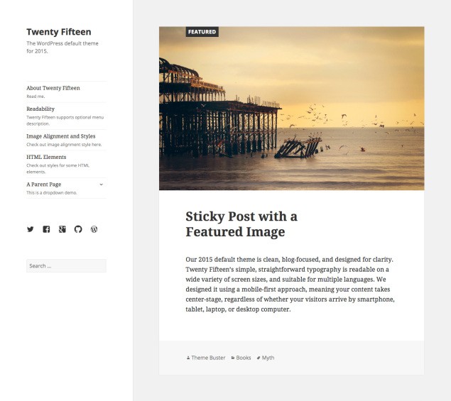
A picture speaks a thousand words
It allows wide, hi-definition images with single background. You can add a different background colour or responsive background image to each of your images or posts. New inline image editing tool bar allows aligning images without opening them in media editor. Plug-ins are available for SVG (Scalable Vector Graphics) files, which prevent image distortion and deliver images that are scalable and adjust to any resolution, while maintaining image quality. You can even add full screen video backgrounds to your page. Now catching attention is really easy.
What’s on the menu?
The vertical Menu design in 2015 is simple and easy to navigate. You can even add menu descriptions through custom fields. This gives the page a neat, well-structured look and makes navigation way easier. Visitors can now assess the content on your page at a glance and quickly access the content they are looking for.
Mobile is the way to go!
Like almost everything else today, Twenty Fifteen adopts a Mobile first, responsive design. Its scroll-over-click approach, coupled with sensible break points and collapsible menus provide optimal browsing experience across devices. As per a study, 34% of organic search and 42% of social visits originated from mobile devices. A responsive design provides a good user experience with minimum user intervention in the form of resizing or scrolling. It offers a host of premium one-page sites which work well with mobile users. Now your visitors can have a good site experience no matter if they are using a laptop, a smartphone, tablet or desktop.
To each man his own
Twenty Fifteen allows easy customization through custom headers and custom backgrounds. You can change color themes and add different background color or responsive background image for every single post or page. With WP-API, custom dashboards will be easy for the technically inclined. You can also choose social media icons from over twenty popular icons available to add to your posts. The Typecase plugin from the WordPress plugin directory lets you choose from over 650 fonts. All of these enable you to give a unique appearance to your website. And you can even choose your language from the language pack in General Settings. This multi-language support helps you reach a wide audience across the world.
Simple, yet appealing
Twenty Fifteen brings the simplified look of Flat Design pages with minimalistic design. The extensive use of whitespace makes the pages uncluttered and easy on the eyes. Pictures really shine and overall, the pages look elegant. It has a streamlined, efficient design and the minimalistic approach also makes pages load faster.
Take your website to where your readers are
Twenty Fifteen comes with HTML5, CSS3 and cross-browser support. HTML5 and CSS3 provide for faster loading of web pages, even in readers with slow internet connection. Cross-browser support makes your page accessible to a wider audience using a range of browsers.
Distraction-free writing
A highlight of Twenty Fifteen is distraction-free writing. When you turn on the distraction-free mode, the editing tools disappear, giving you free space to concentrate on your writing. Only the essential tools required for writing remain within reach. When you move your mouse out of the editor, all the editing tools reappear.
With WordPress Twenty Fifteen, the content you created with so much love and hard work finally get to be the centerpiece of your web page. And, what’s more, you now have the power to draw more visitors with awesome pages created in the language of your choice. Pages load faster, pictures display better and you can deliver a consistent look and feel across devices. What more could you have asked for?
Say Hello to WordPress Twenty Fifteen
previous post